Page 1 of 1

Funishment posts stuff about the uniforms

PostPosted: Wed Nov 13, 2019 7:14 pm
by Corporal Funishment
MAIN JERSEYS
This is the main combo we currently use and it is better than recent past iterations

Image
Image


ALTERNATIVE CURSIVE SCRIPT JERSEYS
This is what we should be using all the time because it's great

Image
Image

(although the rolled up waistband to shorten the shorts messes up the look)


ALTERNATIVE GRAY JERSEYS
personally I find these to be a bit drab on tv
they have a city skyline on the back and the shorts

Image
Image
Image


REGARDING THE NAMES ON THE BACK OF THE JERSEYS
The names were already a touch small in 2018, why did we make them smaller????

2019:
Image
Image

2018:
Image

You will notice that the cursive script jerseys were able to get font size correct....
Image

MORE TO COME....

Re: Funishment posts stuff about the uniforms

PostPosted: Wed Nov 13, 2019 7:19 pm
by Corporal Funishment
This is on social media. Is it a photoshop? real? homemade?

Count me as intrigued

Image

Re: Funishment posts stuff about the uniforms

PostPosted: Wed Nov 13, 2019 7:23 pm
by Corporal Funishment
TERRIBLE JERSEYS OF THE DONAHUE DAYS
no wonder this team lost all the time, dressed like this

Image
Image

Re: Funishment posts stuff about the uniforms

PostPosted: Wed Nov 13, 2019 7:31 pm
by Corporal Funishment
SKINNER ERA JERSEYS
I remember liking these at the time, but the look seems dated today. And the shorts are ludicrous

Image
Image
Image

Re: Funishment posts stuff about the uniforms

PostPosted: Wed Nov 13, 2019 7:34 pm
by Corporal Funishment
older jerseys I quite like

Image

Re: Funishment posts stuff about the uniforms

PostPosted: Wed Nov 13, 2019 8:00 pm
by MF73-Eleazar
the JOB era jerseys were really nice.

cursive script jerseys look amazing, would love to buy one.

Re: Funishment posts stuff about the uniforms

PostPosted: Wed Nov 13, 2019 8:07 pm
by Tom Dooder
The font size on the names is atrocious and angers me greatly.

Re: Funishment posts stuff about the uniforms

PostPosted: Wed Nov 13, 2019 9:01 pm
by BCSUPERFAN22
I got a few pairs of the shorts from the Tyrese/RJ era and they’re the most comfortable things I own.

I liked the grey cursive uni they did with Reebok (I think) when Dudley was here, I’d love to see them do a gold “throwback” with the cursive Boston College on the chest or try to do a different alternate every year or something as a changeup to the base. I agree the base uni that we’re seeing this year is probably the best version we’ve seen (minus the small names on back).

Edit: These were the grey ones that worked well

Image

Re: Funishment posts stuff about the uniforms

PostPosted: Wed Nov 13, 2019 10:11 pm
by 2001Eagle
Corporal Funishment {l Wrote}:SKINNER ERA JERSEYS
I remember liking these at the time, but the look seems dated today. And the shorts are ludicrous

Image
Image
Image


Craig was such a fucking badass

Re: Funishment posts stuff about the uniforms

PostPosted: Thu Nov 14, 2019 8:33 am
by claver2010
i like the cursive jersey that ky & chatman are wearing above

Re: Funishment posts stuff about the uniforms

PostPosted: Thu Nov 14, 2019 7:34 pm
by MF73-Eleazar
claver2010 {l Wrote}:i like the cursive jersey that ky & chatman are wearing above


iirc, only the grey skyliine jersey is available at the bookstore website, sadly.

Re: Funishment posts stuff about the uniforms

PostPosted: Thu Nov 14, 2019 7:50 pm
by Onyx Blackman
What's going to happen when Under Armour goes belly up? Is the offer from LA Gear still on the table?

Re: Funishment posts stuff about the uniforms

PostPosted: Wed Dec 18, 2019 1:41 pm
by xu9697
Football with new coach...basketball soon to follow (hopefully). Time for the rebrand!

Oh, and c'mon UA/BC- GET IN on some t-shirts with our new slogan!

Re: Funishment posts stuff about the uniforms

PostPosted: Wed Dec 18, 2019 9:24 pm
by innocentbystander
xu9697 {l Wrote}:Football with new coach...basketball soon to follow (hopefully). Time for the rebrand!

Oh, and c'mon UA/BC- GET IN on some t-shirts with our new slogan!


Rebrand is right! I think the students should show up at every basketball game wearing t-shirts that say the following:

Jim Christian

Get Out

Re: Funishment posts stuff about the uniforms

PostPosted: Fri Apr 16, 2021 11:57 am
by BCEagles25
https://www.bcinterruption.com/2021/4/16/22386768/boston-college-mens-basketball-historic-uniform-rankings-eagles-ncaa-throwback-retro-new-balance

At long last, Funishment publishes his article.

Rankings (IMO)

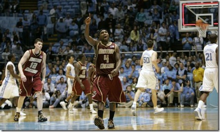
1. Reebok's Al Skinner era (2000's)
1b. Reebok's Al Skinner gold
2. Under Armour’s Base Away Uni’s / Reebok's gold letters Maroon Jersey combo
Image
Image
3. UA’a Base Home Uni’s
4. Grey throwbacks (worn vs Villanova this year)
5. 80’s/90’s (still good)
6. Cursive Script Eagles
7. Grey alternate city skyline
.
.
.
90. Squishing BOSTON COLLEGE into a small area at the top

Re: Funishment posts stuff about the uniforms

PostPosted: Fri Apr 16, 2021 12:39 pm
by claver2010
who knew funishmnent was another tubasteak who posted pronouns in the twitter profile

Re: Funishment posts stuff about the uniforms

PostPosted: Fri Apr 16, 2021 12:41 pm
by twballgame9
The one Huckaby is wearing and the everything else. Screw Reebok red and slanty letters.

Re: Funishment posts stuff about the uniforms

PostPosted: Fri Apr 16, 2021 3:45 pm
by BCEagles25
twballgame9 {l Wrote}:The one Huckaby is wearing and the everything else. Screw Reebok red and slanty letters.

Sacrilege! I will respond to you in all slants now

Re: Funishment posts stuff about the uniforms

PostPosted: Thu Sep 16, 2021 9:50 pm
by BCEagles25
It looks like New Balance misinterpreted Earl’s gritty not pretty slogan

Re: Funishment posts stuff about the uniforms

PostPosted: Tue Sep 28, 2021 1:46 pm
by MF73-Eleazar
Practice jerseys look nice. 95% maroon, with gold trim around collar, arm holes, bottom of jersey and shorts. Big Eagle on the front, but still uses the lame slanted BC logo.

https://twitter.com/BCMBB/status/1442859755760877573

Re: Funishment posts stuff about the uniforms

PostPosted: Tue Oct 12, 2021 6:17 pm
by BCEagles25
MF73-Eleazar {l Wrote}:Practice jerseys look nice. 95% maroon, with gold trim around collar, arm holes, bottom of jersey and shorts. Big Eagle on the front, but still uses the lame slanted BC logo.

https://twitter.com/BCMBB/status/1442859755760877573


I would prefer these to the game ones they rolled out. Looks like New Balance misinterpreted Pat Kraft’s request to “try and top what Under Armour did”