New Logo

Forum rules
"The opinions expressed on this board are property of the poster and do not reflect the opinion of EagleOutsider, Boston College or Boston College Athletics"

New Logo

Postby joeyfenn on Tue Jan 01, 2013 11:10 am

Atl brought up this idea and I agree.

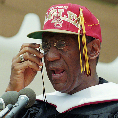
We've got rid of the italics (a.k.a. the slanty number). Reebok's been gone for many years. The regime that ushered the logo is now an old memory. Maybe 2013 is the year we should finally refresh the BC logo. I don't mind the eagle above. I also can live with the spacing and the gold/white trim. I just want to get rid of the slant. Or we can go with something completely new. I just think now is the time to get moving on the new look. Make all the relevant decisions in the next few months and then roll it out in September with the new school year! It will be the fresh start many of our teams need.


There is so much we can do. It's worth at least working in a new alternate logo like we tried with the angry chicken
joeyfenn
McGuinn Hall
 
Posts: 738
Joined: Tue Aug 03, 2010 6:05 pm
Karma: -31

Re: New Logo

Postby HJS on Tue Jan 01, 2013 11:25 am

It should be done in step with completely revamped unis. I've said it before and I'll say it again, BC will never be able to catch up with the fucktarded trend started by Oregon. If we try, we'll come off looking like Rutgers. We should go the opposite direction. Pick very classic/throwback unis. I've suggested something like what we wore for one game against Rutgers back in like 2004. Others have suggested PSU in maroon and gold. Whatever, going classic would probably get more attention than whatever the fuck UA made us where under Spaz. Parlay that with a back-to-basics redesign of the logo. Allow UA to stick us in one crazy uni a year (like the wounded warriors) and keep Baldwin and Baldwin Jr as is.

Here is the thread: viewtopic.php?f=4&t=10769&hilit=+Throwback

Image
"The Michelangelo of stupidity is again on top of his scaffolding, lying on his back and painting a masterpiece of imbecility on the ceiling of a virtual Sistine Chapel." © 2023 A AngryDick Joint
User avatar
HJS
Gasson Hall
 
Posts: 16622
Joined: Sat Sep 05, 2009 12:08 pm
Karma: 606

Re: New Logo

Postby BCSUPERFAN22 on Tue Jan 01, 2013 11:39 am

I've seen next years Under Armour on field catalog and I can assure you there will be no change to the logo. All the designs are set and next years on field apparel is going to feature the "stained glass" pattern (each school is going to a set "theme" or pattern that the new apparel will feature). Orders are due (I assume for merchants like the bookstore) in 2 weeks so don't count on any kind of logo change this season.
BCSUPERFAN22
Merkert Hall
 
Posts: 3494
Joined: Sat Sep 05, 2009 9:21 pm
Karma: 125

Re: New Logo

Postby HJS on Tue Jan 01, 2013 11:43 am

BCSUPERFAN22 {l Wrote}:I've seen next years Under Armour on field catalog and I can assure you there will be no change to the logo. All the designs are set and next years on field apparel is going to feature the "stained glass" pattern (each school is going to a set "theme" or pattern that the new apparel will feature). Orders are due (I assume for merchants like the bookstore) in 2 weeks so don't count on any kind of logo change this season.

There is nothing more retarded than that stained glass bullshit. What we wore this year was terrible... in particular the 49ers white stripe on the helmet. I largely don't care much as this has been the forgotten era of BC football. So it has been fitting that we've had the most forgettable unis in history.

BTW... I actually miss Reebok. Their unis were better and they put us in more stores than UA ever has. Reebok gear sucked, but at least you can find places where it could be purchased. Oh yeah... they also made shoes that didn't cause injuries.
"The Michelangelo of stupidity is again on top of his scaffolding, lying on his back and painting a masterpiece of imbecility on the ceiling of a virtual Sistine Chapel." © 2023 A AngryDick Joint
User avatar
HJS
Gasson Hall
 
Posts: 16622
Joined: Sat Sep 05, 2009 12:08 pm
Karma: 606

Re: New Logo

Postby BCSUPERFAN22 on Tue Jan 01, 2013 12:11 pm

Heres some of the examples from next seasons UA catalog ...

A few things. The below pic is the replica jerseys they plan to sell, so it would appear no changes. Alot of the logos/designs towards the bottom are logos that go on either tshirts or sweatshirts. The rest is fairly self explanatory.

FWIW, I didnt mind the uniforms this season. I agree that the dual stripe helmets are beyond stupid, but the uniforms were pretty basic and not really a ton to like or hate. One small thing I wish they did (and find it stupid from a UA marketing perspective) is having a logo somewhere on the uniform, either on the bottom of the neck or on the sleeve (like with the Jags era unis which I liked the best). I agree with HJS, give UA the freedom to do something stupid once a year. I thought the gold uniforms this season were a good idea but could have been so much more (seems like it was just slapped together last second).

I dont know if it is a standard thing, but I was always under the impression that when there is a regime change within a program the uniforms change as well, at least that was the case when Jags took over (and probably would have been the case when dipshit took over had it not been for timing when the Under Armour contract started, and it eventually did change to what we have now).

Image

Image

Image

Image

Image

Image

Image

Image

Image

Image

Image

Image

Image
BCSUPERFAN22
Merkert Hall
 
Posts: 3494
Joined: Sat Sep 05, 2009 9:21 pm
Karma: 125

Re: New Logo

Postby BCMurt09 on Tue Jan 01, 2013 12:13 pm

HJS {l Wrote}:
BCSUPERFAN22 {l Wrote}:I've seen next years Under Armour on field catalog and I can assure you there will be no change to the logo. All the designs are set and next years on field apparel is going to feature the "stained glass" pattern (each school is going to a set "theme" or pattern that the new apparel will feature). Orders are due (I assume for merchants like the bookstore) in 2 weeks so don't count on any kind of logo change this season.

There is nothing more retarded than that stained glass bullshit. What we wore this year was terrible... in particular the 49ers white stripe on the helmet. I largely don't care much as this has been the forgotten era of BC football. So it has been fitting that we've had the most forgettable unis in history.

BTW... I actually miss Reebok. Their unis were better and they put us in more stores than UA ever has. Reebok gear sucked, but at least you can find places where it could be purchased. Oh yeah... they also made shoes that didn't cause injuries.


How long is our contract with UA. Well, what I'm really asking is when can we get Nike gear.
"...and Lane Stadium goes silent..."

"On a red bandanna night, it's going to be a red letter day"

"Drive by Girardi and a save. Rebound...SCORE!"

"Stroud in trouble and Stroud is sacked again! Oh-jah-BO!"
User avatar
BCMurt09
Merkert Hall
 
Posts: 3822
Joined: Tue Sep 08, 2009 11:49 am
Karma: 639

Re: New Logo

Postby HJS on Tue Jan 01, 2013 12:23 pm

I posted it somewhere when Maryland left. But, I think we have 4 years left.

What BC needs to do is take its design/uni development to an outside shop (not u like what they did when they created slangy numbers). Once you have your design and colors selected and TM'd, you go to UA and force them to redesign the unis around your vision.
"The Michelangelo of stupidity is again on top of his scaffolding, lying on his back and painting a masterpiece of imbecility on the ceiling of a virtual Sistine Chapel." © 2023 A AngryDick Joint
User avatar
HJS
Gasson Hall
 
Posts: 16622
Joined: Sat Sep 05, 2009 12:08 pm
Karma: 606

Re: New Logo

Postby BCSUPERFAN22 on Tue Jan 01, 2013 12:39 pm

HJS {l Wrote}:I posted it somewhere when Maryland left. But, I think we have 4 years left.

What BC needs to do is take its design/uni development to an outside shop (not u like what they did when they created slangy numbers). Once you have your design and colors selected and TM'd, you go to UA and force them to redesign the unis around your vision.


I personally dont mind the contract with Under Armour. Reebok was fine, and if they stayed with Reebok I wouldn't have had a problem with it. I think with Reebok losing the NFL contract however, maybe they didn't make as big of a push to keep BC (if they were losing the NFL just dissolve the entire business).

If BC went with UA or Nike after the Reebok contract, I really dont think I would have personally cared much. I like that BC is one of a few schools under contract with UA rather than being one of a hundred with Nike and I think UA has done an OK job so far.
BCSUPERFAN22
Merkert Hall
 
Posts: 3494
Joined: Sat Sep 05, 2009 9:21 pm
Karma: 125

Re: New Logo

Postby joeyfenn on Tue Jan 01, 2013 1:50 pm

Under Armour is infinitely cooler than Reebok. Reebok is old guy style. UA material kicks reeboks ass and recruits/high schoolers like UA much better.

Under Armour is not the issue. If anything Under Armour is a positive because they are really striving to out due Nike right now.

The stained glass idea was worth a shot but clearly hasnt worked out. Anything else we could try along those lines?
joeyfenn
McGuinn Hall
 
Posts: 738
Joined: Tue Aug 03, 2010 6:05 pm
Karma: -31

Re: New Logo

Postby HJS on Tue Jan 01, 2013 2:18 pm

Under Armor does something's good. Their workout gear is superior to Nike's. But their shoes are a complete FAIL. And, their unis are clownshoes. The only uni they do well is Auburn... who told them not to fuck with it. I also find it pathetic that UA simply copycats Nike in creating ridiculous, over-the-top crap. Nike originated it for Oregon, UA doing it for Maryland confirms its wannabe status. What's more, is that BC and the rest aren't MD. UA supports the other 9 schools worse than Nike supports its 50th property. UA is cooler as a brand than Reebok (which is now owned by Addidas and is being phased into Hockey only). But that means shit when the execution is so piss-poor.

Bates needs to take control of his brand. He needs to figure out how he wants the team to look and then force UA to comply. UA left to its own devices, results in the forced "trying to be cool" crap we force our future alums to dress up in.
"The Michelangelo of stupidity is again on top of his scaffolding, lying on his back and painting a masterpiece of imbecility on the ceiling of a virtual Sistine Chapel." © 2023 A AngryDick Joint
User avatar
HJS
Gasson Hall
 
Posts: 16622
Joined: Sat Sep 05, 2009 12:08 pm
Karma: 606

Re: New Logo

Postby hansen on Tue Jan 01, 2013 2:37 pm

I would love to see BC go old skool and do a maroon/gold PSU style uniform... Gimmick uniforms are for teams that have no tradition and/or success on the field.
HANSENPOST :shrug

Image
User avatar
hansen
Gasson Hall
 
Posts: 19048
Joined: Sat Sep 05, 2009 8:07 pm
Location: Your Mom’s House
Karma: -2237

Re: New Logo

Postby HJS on Tue Jan 01, 2013 2:41 pm

hansen {l Wrote}:I would love to see BC go old skool and do a maroon/gold PSU style uniform... Gimmick uniforms are for teams that have no tradition and/or success on the field.

Exactly. By going old school, we'd actually be different. I hate how our school just makes so many obviously bad decisions when it comes to athletics.
"The Michelangelo of stupidity is again on top of his scaffolding, lying on his back and painting a masterpiece of imbecility on the ceiling of a virtual Sistine Chapel." © 2023 A AngryDick Joint
User avatar
HJS
Gasson Hall
 
Posts: 16622
Joined: Sat Sep 05, 2009 12:08 pm
Karma: 606

Re: New Logo

Postby westcoastbernie on Tue Jan 01, 2013 8:50 pm

Go UCLA with maroon and gold. the maroon/gold/white stripes over the shoulders, straight gold numbers, bright gold helmets with NO stripes at all, bright gold pants with NO stripes. Road unis would be white shirts, maroon/gold stripes over the shoulders, bright/shiny gold pants. It is old school but it is classic and bright. The military gold has got to go. Go back to the sparkling gold that was around when Flutie played....classic and worn by winners!!
westcoastbernie
Carney Hall
 
Posts: 151
Joined: Sat Aug 18, 2012 10:57 am
Karma: 18

Re: New Logo

Postby Supahfan99 on Wed Jan 02, 2013 10:54 am

I think you guys have a point in going classic style.

BC's got a tradition (more than people nationally realize) and has been a great football program for a long time. BC needs to sell that and should incorporate that into their brand. FWIW, I don't have a real problem with the uniforms we had going on in the Matt Ryan era. Loved that "unofficial" eagle logo we had on the sleeves. Slanty numbers didn't bother me terribly. Now they're gone and we are in a new font. Really, the logo redesign of 2000 (summer) isn't all that long ago. I think we can call a spade a spade and say it was not wildly successful but probably wasn't a flop either since it needed to be done and did ok.

The stained glass thing is some of the dumbest shit I've ever seen.
Supahfan99
Campion Hall
 
Posts: 1641
Joined: Thu Oct 15, 2009 9:13 pm
Karma: 185

Re: New Logo

Postby twballgame9 on Wed Jan 02, 2013 11:32 am

Image

imagine the blue as Image

and the silver as Image
"We remind everyone that Boston College fired a perfectly good coach because he went on a job interview, and deserves all of this." Spencer Hall
User avatar
twballgame9
BC Guy
 
Posts: 34379
Joined: Sat Sep 05, 2009 8:49 am
Karma: 2489

Re: New Logo

Postby whalepants on Wed Jan 02, 2013 11:36 am

Joe yukica did that fake Penn State look in 1970
whalepants
Carney Hall
 
Posts: 149
Joined: Thu Sep 10, 2009 2:30 pm
Karma: -2

Re: New Logo

Postby HJS on Wed Jan 02, 2013 11:37 am

Isn't that pretty much the commerative unis of the Redskins that Nike created (which I posted in the Reebok thread)??? I'd have no problem with that at all.
Image
Last edited by HJS on Wed Jan 02, 2013 11:38 am, edited 1 time in total.
"The Michelangelo of stupidity is again on top of his scaffolding, lying on his back and painting a masterpiece of imbecility on the ceiling of a virtual Sistine Chapel." © 2023 A AngryDick Joint
User avatar
HJS
Gasson Hall
 
Posts: 16622
Joined: Sat Sep 05, 2009 12:08 pm
Karma: 606

Re: New Logo

Postby twballgame9 on Wed Jan 02, 2013 11:38 am

HJS {l Wrote}:Isn't that pretty much the commerative unis of the Redskins that Nike created (which I posted in the Reebok thread)???


Yes, because you were certainly the first person to make this suggestion.

*Red font not necessary.
"We remind everyone that Boston College fired a perfectly good coach because he went on a job interview, and deserves all of this." Spencer Hall
User avatar
twballgame9
BC Guy
 
Posts: 34379
Joined: Sat Sep 05, 2009 8:49 am
Karma: 2489

Re: New Logo

Postby HJS on Wed Jan 02, 2013 11:41 am

twballgame9 {l Wrote}:
HJS {l Wrote}:Isn't that pretty much the commerative unis of the Redskins that Nike created (which I posted in the Reebok thread)???


Yes, because you were certainly the first person to make this suggestion.

*Red font not necessary.

I posted it in the Reebok thread to show I didn't make the suggestion. And, for the record... neither did you. OnyxBlackman is the one who gets credit for the Wayne Fontes unis that pretty much everyone likes.
"The Michelangelo of stupidity is again on top of his scaffolding, lying on his back and painting a masterpiece of imbecility on the ceiling of a virtual Sistine Chapel." © 2023 A AngryDick Joint
User avatar
HJS
Gasson Hall
 
Posts: 16622
Joined: Sat Sep 05, 2009 12:08 pm
Karma: 606

Re: New Logo

Postby DavidGordonsFoot on Wed Jan 02, 2013 11:52 am

I would like to hear James Kilmeady's suggestion for new unis.
hello
User avatar
DavidGordonsFoot
Gasson Hall
 
Posts: 15042
Joined: Sat Sep 05, 2009 11:56 pm
Location: Not tobaccoroad
Karma: 2942

Re: New Logo

Postby PhillyandBCEagles on Wed Jan 02, 2013 11:56 am

I'm fine with the Redskins/Lions uniform, but don't get rid of the maroon stripe on the helmet. I'd also like to see us bring the slanty numbers back but that's a losing battle. Other than that I like maroon jerseys with gold pants as our base home uniforms, gold on maroon once a year, and throwback jerseys (1984 or 1993) or UnderArmor visual abortions once every 2-3 years each. On the road go with all whites at ND/VT/Cuse/Clemson/Miami and for any night game, white jerseys and maroon pants otherwise.
PhillyandBCEagles
Merkert Hall
 
Posts: 3072
Joined: Sat Sep 05, 2009 12:28 pm
Karma: 827

Re: New Logo

Postby HJS on Wed Jan 02, 2013 12:20 pm

PhillyandBCEagles {l Wrote}:I'm fine with the Redskins/Lions uniform, but don't get rid of the maroon stripe on the helmet. I'd also like to see us bring the slanty numbers back but that's a losing battle. Other than that I like maroon jerseys with gold pants as our base home uniforms, gold on maroon once a year, and throwback jerseys (1984 or 1993) or UnderArmor visual abortions once every 2-3 years each. On the road go with all whites at ND/VT/Cuse/Clemson/Miami and for any night game, white jerseys and maroon pants otherwise.

BC should never wear maroon pants. Pants should be only gold or white. Jerseys should be only white or maroon.
"The Michelangelo of stupidity is again on top of his scaffolding, lying on his back and painting a masterpiece of imbecility on the ceiling of a virtual Sistine Chapel." © 2023 A AngryDick Joint
User avatar
HJS
Gasson Hall
 
Posts: 16622
Joined: Sat Sep 05, 2009 12:08 pm
Karma: 606

Re: New Logo

Postby joeyfenn on Wed Jan 02, 2013 12:35 pm

BC should never wear maroon pants. Pants should be only gold or white. Jerseys should be only white or maroon.


No this is blatantly false.
joeyfenn
McGuinn Hall
 
Posts: 738
Joined: Tue Aug 03, 2010 6:05 pm
Karma: -31

Re: New Logo

Postby TobaccoRoadEagle on Wed Jan 02, 2013 3:52 pm

This thread is for homosexuals. And yes, I'm the one pointing that out. All of you should feel deep shame.
now in the street there is violence
and, and a lots of work to be done
no place to hang out our washing
and, and i can't blame all on the sun
good god we gonna rock down to electric avenue
and then we'll take it higher
User avatar
TobaccoRoadEagle
BC Guy
 
Posts: 24016
Joined: Wed Sep 02, 2009 7:51 am
Location: tobaccoroad
Karma: 6074

Re: New Logo

Postby hansen on Wed Jan 02, 2013 4:30 pm

TobaccoRoadEagle {l Wrote}:This thread is for homosexuals. And yes, I'm the one pointing that out. All of you should feel deep shame.


Image
HANSENPOST :shrug

Image
User avatar
hansen
Gasson Hall
 
Posts: 19048
Joined: Sat Sep 05, 2009 8:07 pm
Location: Your Mom’s House
Karma: -2237

Re: New Logo

Postby BCEagles25 on Thu Jan 03, 2013 7:44 am

Pittsburgh Steelers. Or go back to the 2004 era uni's. Even the slantys of 2007 were better than the bland excuse for a jersey we have now.
I like BC basketball.
User avatar
BCEagles25
Higgins Hall
 
Posts: 4567
Joined: Sun Sep 06, 2009 12:42 pm
Karma: 121

Re: New Logo

Postby Endless Mike on Thu Jan 03, 2013 10:30 am

I'd like to see them use a unique uniform set for special games, and go wild with that. I have to admit, the stained glass design has grown on me. I'd like to get rid of the white helmet stripe and see how the stained glass pattern looks on the gold helmets and other gold parts of the uniform for a potential special uniform. It reminds me of the honeycomb pattern that Georgia Tech uses. These are the kinds of sleek designs that win over big recruits. Kids love stained glass windows and beekeeping.

As far as the regular uniforms go, the cleanest, simplest look is usually the best. I really like the uniforms Louisville wore last night.
Last edited by Endless Mike on Tue Apr 30, 2013 9:09 pm, edited 1 time in total.
User avatar
Endless Mike
Lyons Hall
 
Posts: 8489
Joined: Wed Sep 02, 2009 6:02 pm
Karma: 1613

Re: New Logo

Postby HJS on Tue Apr 30, 2013 8:49 pm

Apparently two pieces regarding costume changes leaked today.

The first is that Dazoo has decided to follow Don's lead and remove the names from the Jersey. This is retarded. In college, player names is about the only way you know who the fuck the players are. No one wants to sit there looking at a roster list to figure out who that new guy was starting at RG.

The second apparently involves a poster on TOS who somehow got his hands on a new helmet... and it didn't have a stripe anymore.
"The Michelangelo of stupidity is again on top of his scaffolding, lying on his back and painting a masterpiece of imbecility on the ceiling of a virtual Sistine Chapel." © 2023 A AngryDick Joint
User avatar
HJS
Gasson Hall
 
Posts: 16622
Joined: Sat Sep 05, 2009 12:08 pm
Karma: 606

Re: New Logo

Postby TobaccoRoadEagle on Tue Apr 30, 2013 9:02 pm

i guess rather than the alabama/harvard of yesteryear, the master is looking to move to a domer/harvard comparison
now in the street there is violence
and, and a lots of work to be done
no place to hang out our washing
and, and i can't blame all on the sun
good god we gonna rock down to electric avenue
and then we'll take it higher
User avatar
TobaccoRoadEagle
BC Guy
 
Posts: 24016
Joined: Wed Sep 02, 2009 7:51 am
Location: tobaccoroad
Karma: 6074

Re: New Logo

Postby BCSUPERFAN22 on Tue Apr 30, 2013 9:10 pm

HJS {l Wrote}:Apparently two pieces regarding costume changes leaked today.

The first is that Dazoo has decided to follow Don's lead and remove the names from the Jersey. This is retarded. In college, player names is about the only way you know who the fuck the players are. No one wants to sit there looking at a roster list to figure out who that new guy was starting at RG.

The second apparently involves a poster on TOS who somehow got his hands on a new helmet... and it didn't have a stripe anymore.


Did he post a picture of the helmet or just post a rumor ? FWIW, ive seen pictures during spring practice where the helmets dont have a stripe (the decal just hasnt been put on). I think the traditional 1 stripe is fine.

Image
BCSUPERFAN22
Merkert Hall
 
Posts: 3494
Joined: Sat Sep 05, 2009 9:21 pm
Karma: 125

Next

Return to Alumni Stadium

Who is online

Users browsing this forum: No registered users and 80 guests

Untitled document